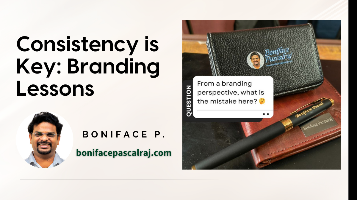
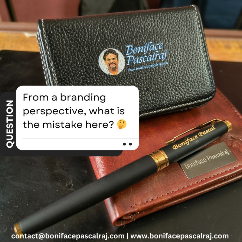
Branding is a journey, not just a one-time activity. It extends beyond the logo or color palette—it is a continuous process of refining how you represent yourself or your business at every touchpoint. When I shared a post about my pen, wallet, and visiting card holder, I sought feedback on how these items aligned with my personal brand. The response was overwhelming, and the insights from my network were incredibly valuable!
When it comes to personal branding, consistency is key. Every touchpoint—whether it is a business card, a pen, or a wallet—should reflect a unified identity. A recent review of my own branding items revealed a few inconsistencies that serve as valuable lessons for anyone looking to strengthen their brand presence. Here are some key takeaways.
1. Brand Name Consistency
- Observation: The visiting card holder and wallet display the full name, “Boniface Pascalraj,” while the pen only uses “Boniface P.”
- Lesson: The brand name should be consistent across all items to avoid confusion. Whether it’s your full name or a shortened version, stick to one format to build a recognizable brand.
2. Website Visibility
- Observation: The visiting card holder displays my website (www.bonifacepascalraj.com), but the pen and wallet don’t.
- Lesson: If you want your audience to connect with you digitally, ensure that your website is consistently included across all branded materials. This small touch can significantly boost your online visibility.
3. Logo and Photo Usage
- Observation: The wallet integrates a photo into the logo, while the pen and visiting card holder use only text.
- Lesson: A personal logo should remain consistent. If your logo includes a photo, ensure it is used across all items or opt for a simpler version without a photo—but apply it universally.
4. Typography Mismatch
- Observation: The font style differs across all items—each using a different design.
- Lesson: Typography plays a crucial role in branding. Using a single font family across materials creates a more professional and cohesive look.
5. Color Scheme
- Observation: The text color varies across items—blue on the wallet, gold on the pen, and a different shade on the visiting card holder.
- Lesson: Maintaining a unified color palette reinforces brand identity. Pick a consistent color scheme that aligns with your brand personality and stick with it.
Why Branding Consistency Matters
Branding is more than just a logo or name; it’s the sum of all interactions people have with you. Every branded item is an opportunity to make a lasting impression. Inconsistent elements can dilute your brand message and confuse your audience, while a cohesive approach builds trust and recognition.
Conclusion
Whether you’re a business professional or an entrepreneur, take a step back and review your branding elements. Are they telling a consistent story? Remember, attention to detail is what sets a strong brand apart.